Introducing the portfolio
This is a responsive portfolio website for a business analyst, designed to showcase her skills, projects, and professional journey. The concept centers on a dashboard-style layout, reflecting her work with data, while keeping the design approachable, clean, and visually inviting with pastel tones, illustrations, and simple icons.
Discovering the client personality
From the very beginning, it was clear that this portfolio needed to be more than just a collection of projects—it had to reflect who my client is. She’s a business analyst who is professional yet approachable, someone who values clarity but also enjoys a touch of creativity. She loves illustrations, icons, and soft, pastel colors, so the challenge was to design a site that felt light, friendly, and easy to navigate, while still showcasing her analytical expertise.
Exploring Possibilities
We spent three full days exploring different directions for the portfolio layout. We wanted something that would attract attention without feeling either too modern and flashy or too traditional and rigid. After multiple discussions, sketches, and iterations, we arrived at an idea we both loved: a portfolio designed like a dashboard. It was perfect because the client day-to-day work revolves around dashboards and data visualization. But we also wanted it to be inviting for visitors who might not love overly “nerdy” or data-heavy designs.
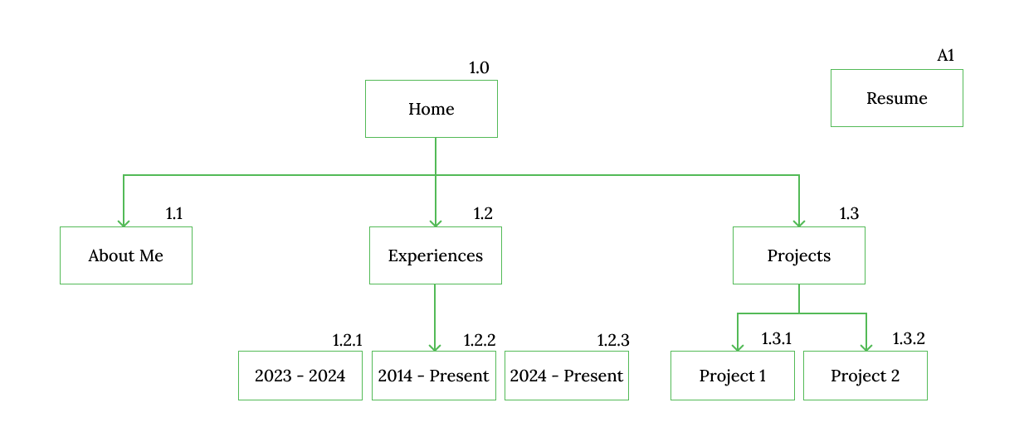
Information Architecture
To keep the portfolio easy to navigate, I started with a simple sitemap to define the overall structure of the website. The goal was to help visitors quickly understand where to find key information without unnecessary complexity.
The site is organized into core sections—Home (Dashboard), Projects, and Resume—allowing users to explore the portfolio intuitively. This clear structure supported the dashboard concept while ensuring recruiters could access important content with minimal effort.
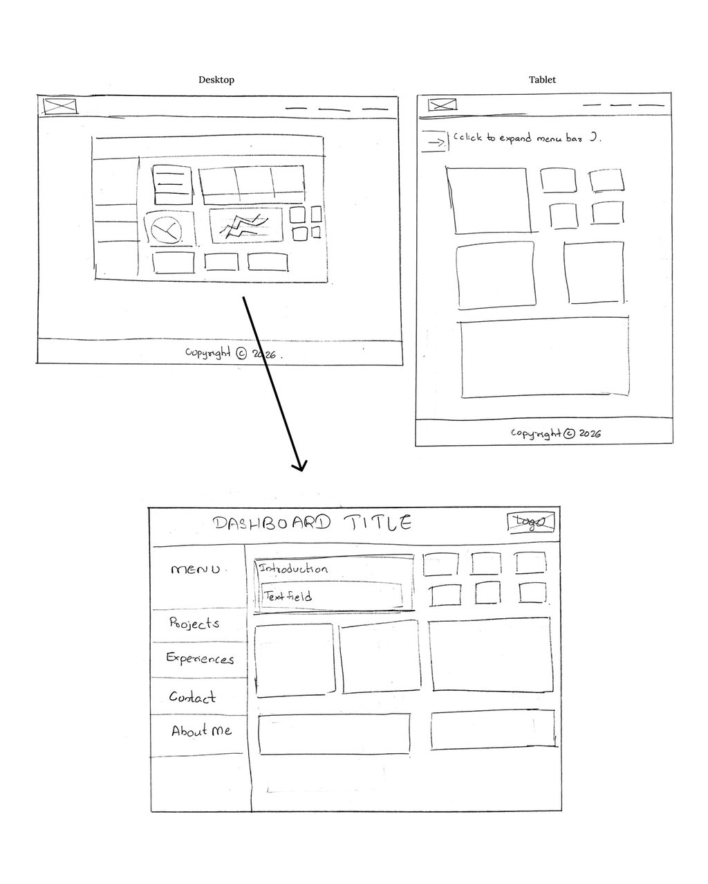
Sketching (Wireframe)
This project wasn’t just about creating a beautiful portfolio; it was about listening, iterating, and translating a client’s character and professional identity into an interface that works. Meetings with the client were essential—understanding her needs, suggesting additions, refining layouts, and testing visualizations. Each decision was made collaboratively, ensuring the final design was something she felt proud to showcase.

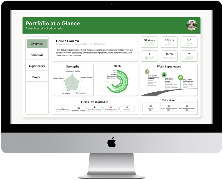
A Dashboard That Tells a Story
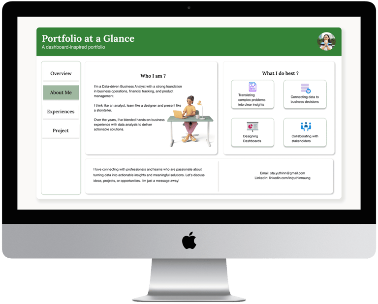
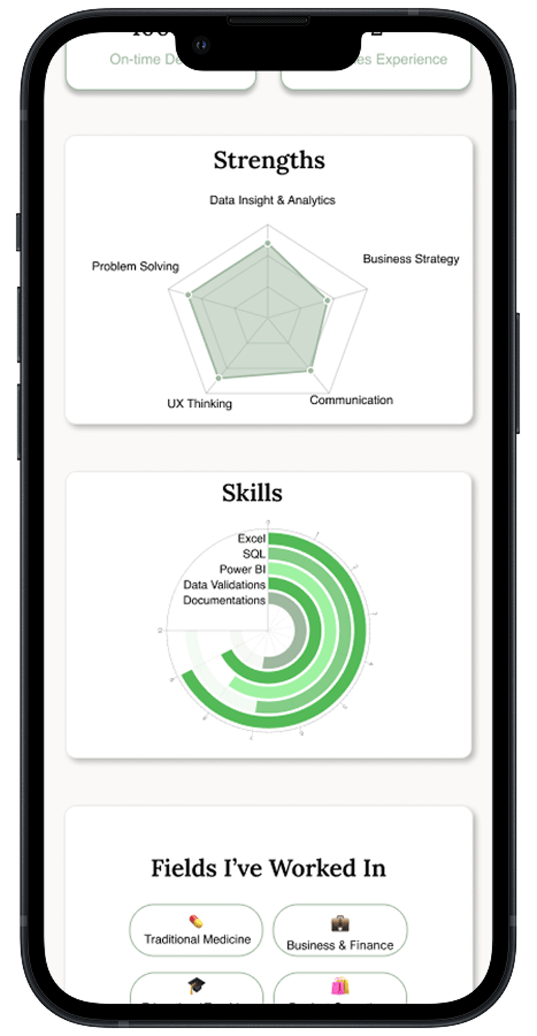
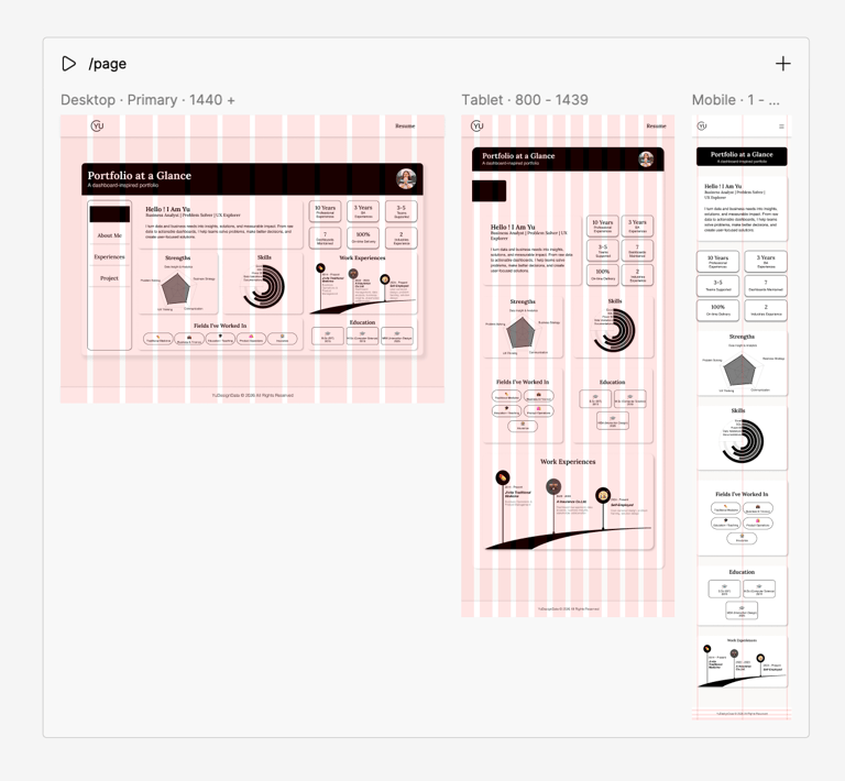
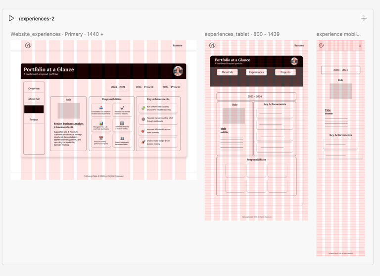
The result is a responsive portfolio that combines functionality with personality. On the desktop version, the homepage is a dashboard, showing her main metrics, skill highlights, and key achievements as clean KPI cards and simple charts. The homepage acts as a dashboard with KPI cards and simple charts, framing three main sections: Home (Dashboard), About Me, and Experiences. Users can switch between these within the dashboard, keeping the experience cohesive.
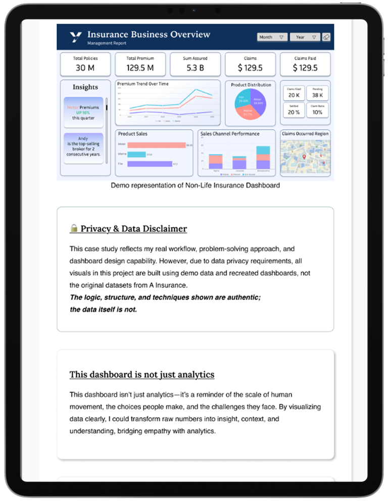
Projects in Perspective
The Projects section introduces two major projects, each linking to its own page. While the case studies are longer than a dashboard can display, their visual style—cards, charts, and organized layouts—echoes the main dashboard for consistency.
Navigating Challenges
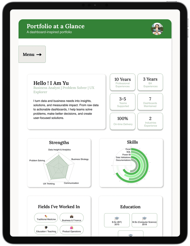
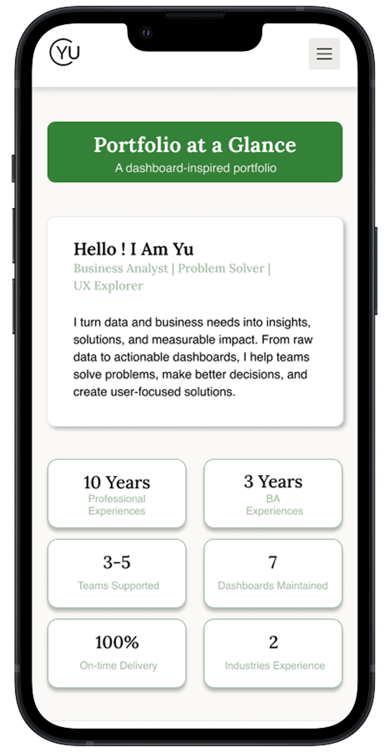
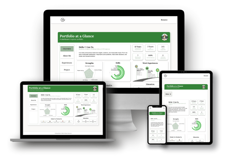
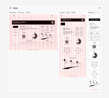
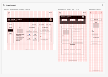
One of the main challenges of this project was responsiveness. The dashboard layout was designed primarily for desktop use and works best at a 16:9 ratio. Instead of forcing the full dashboard to scale down for smaller screens, we made a conscious decision to prioritize core content and KPIs using a card-based layout for tablet and mobile. While the structure changes across devices, the essence of the dashboard remains—something the client appreciated, as it closely reflects her work in Power BI and analytics.
Responsiveness
Responsiveness was considered from the very beginning of the design process. While working in Figma, desktop, tablet, and mobile screens were designed in parallel rather than as an afterthought. This approach helped identify unsupported components early and reduced rework during later iterations. Given the desktop-first nature of the dashboard, extra attention was given to visual consistency and usability on smaller screens, ensuring clarity even when the full dashboard layout could not be preserved.
A Thoughtful Palette
Typography and colour choices were also crucial. We limited the design to two fonts—Lora and Helvetica—to keep the visual hierarchy simple and legible. The colour choice is the client request 'Green' which is her favourite one. Soft pastel tones dominate the palette, giving the site a light, friendly feel, complemented by icons and subtle illustrations that align with the client’s personality.
Collaboration at every step
This project wasn’t just about creating a beautiful portfolio; it was about listening, iterating, and translating a client’s character and professional identity into an interface that works. Meetings with the client were essential—understanding her needs, suggesting additions, refining layouts, and testing visualizations. Each decision was made collaboratively, ensuring the final design was something she felt proud to showcase.
A Portfolio That Reflects Expertise
In the end, the dashboard-style portfolio isn’t just a visual choice; it’s a storytelling tool. It reflects her analytical expertise, her approachable personality, and her love for clean, organized design. Screenshots of the wireframes, dashboards, and project pages capture the journey from concept to final product, showing both the thought process and the care that went into designing a portfolio truly aligned with the client’s identity.