A Tool designed to Help the elderly navigate tech with confidence and support
UX Case Study
Role
UX Research
Wireframing
Platform
Mobile App
Tools
Figma / Figjam
Miro
Timeline
3 Weeks
Designing a tool to bridge families across borders
As more young people move abroad, their aging parents are often left struggling to keep up with digital tools — apps for video calling, ordering food, and more. Even a simple action like sending money or making a call can feel overwhelming. This project explores how I designed a tool to bridge that gap: empowering elderly users to complete everyday tasks independently, and giving their children peace of mind knowing support is always just a tap away.
Tech shouldn’t scare the people we love
My brother and I live abroad. Our parents, now in their 70s, are back home — brave and independent. But every time they need to order food, transfer money, or find a document, they call us in a panic. I heard similar stories from friends -
“My mom panics when she presses the wrong thing.”
“My grandma calls me just to ask how to take a screenshot."
That’s when I realised: tech is made for the young, not for those who need help the most.
This story sparked the project. Not just a product — but a tool for peace of mind.
What would technology look like if it were built with care?
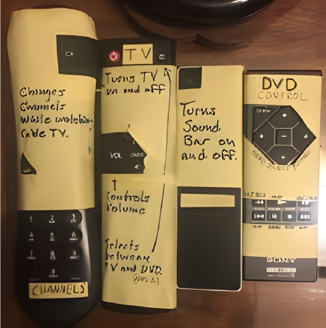
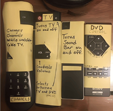
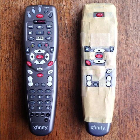
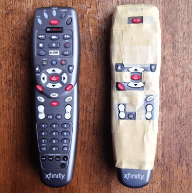
We’ve all seen this image online for years. It isn’t broken — it’s simplified. Many elders simplify devices on their own, because technology isn’t built for them. That moment made me ask: It’s easy to tape off a TV remote. Many elders do this themselves. But in today's digital age, how do you tape off an app? That moment made me ask: "What would technology look like if it were designed with care — not just crammed with features?"
Can an App feel like a helping hand?
How might we create a mobile app that supports aging parents — with low digital literacy — to feel connected, safe, without fear, confusion, or reliance on their children for every small task? How might we design a mobile app that enables adult children to support their aging parents — without repeated explanations, unnecessary complexity, or constant back-and-forth communication?
To answer both sides of this challenge, I needed a solution that had to balance simplicity with functionality, something that works for those who need help, and those who give it. So, I set out to design an app for both ends — something simple and comforting for elders, yet efficient enough to ease the burden on busy children.
Listening first, what real families told me
What I heard from elders ?
“I’m scared I’ll break it.”
“I forget the password every time.”
What I heard from children ?
“It’s hard to explain things over the phone”
“She asks me the same question five times.”
60+
Years Old
8
People
24-40
Years Old
12
People
Understanding the elderly experience
To design with empathy, I needed to understand their world. I created an Ecosystem Map with the elderly user at the centre to explore how, when, and why they use mobile devices in their daily lives. Each “slice” in the map showed what they do — and how.
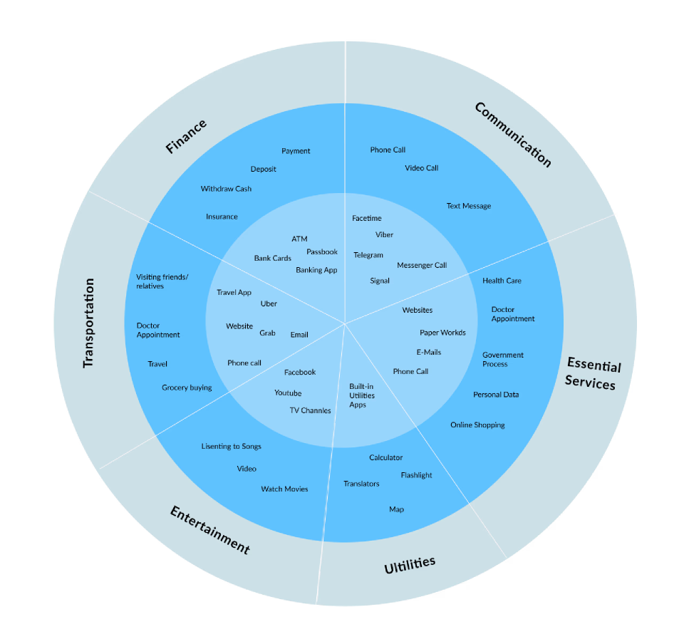
There are six important interactions to consider in older adults' mobile usage.
Communication
Entertainment
Finance
Essential Services
Transportation
Utilities
What I Discovered Beneath the surfaceCommunication
Elders switch between multiple apps, leading to confusion.
Many struggle after receiving documents — printing, resending, or adding to a calendar.
Useful tools are often avoided due to notifications, clutter, or too many steps.
Basic needs are buried under complexity.
Existing solutions designed for senior communication
These insights revealed key user needs—simplicity, emotional connection, and family involvement—which directly influenced my design direction. Facebook Portal offer intuitive video calling, while Papa focus on human companionship without a device component. Oscar Senior combines communication and content in a simplified tablet interface managed by family. Medisafe addresses health needs with reminders but lacks communication tools. GrandPad stands out as a dedicated device with a senior-friendly UI and built-in support.


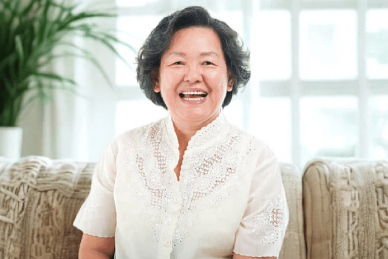
GENTLE GEORGE
“I don’t know where to press”
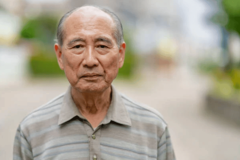
Pain Points
Workarounds
Has trouble navigating digital interfaces
Rearranges the home screen to show only essential apps with large icons
Uncertain about which button does what
Keeps key services accessible without re-authentication
Forgets step even after being shown
Creates paper instructions with photos or drawings of the screen
FORGETTFUL FIONA
“I forget password every-time”
Pain Points
Workarounds
Can’t remember passwords or codes
Use biometrics data for login
Feels embarrassed asking for help repeatedly
Lets trusted family members reset passwords remotely
Gets locked out of apps and needs help resetting credentials
Writes down passwords in a dedicated notebook
CARING CLARA
“I just want my mom to press one button to call me”
Pain Points
Workarounds
Repeats the same explanations over and over
Records personalised video tutorials for specific actions
Worries when her parents can’t reach her or get stuck
Adds a “Call Clara” button right on her mom’s home screen
Feels guilty but has limited time to help
Writes down Uses screen sharing features to guide remotely passwords in a dedicated notebook


A journey in two lives
Gentle George finds banking apps overwhelming. Cluttered icons and frequent UI changes leave him confused, and each update shakes his confidence. How might we help George successfully transfer money — with support from Clara? Let’s explore his user journey in our tool, CareConnect, below.
George open CareConnect, where the screen is calm and simple - only essential buttons.


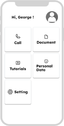


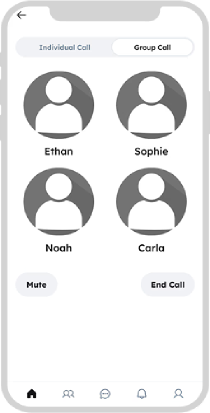

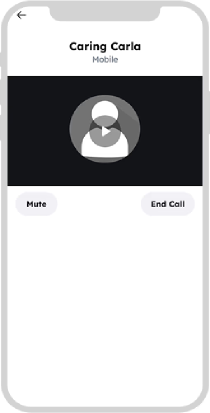
George simply taps “Call” — no app-switching, no searching. The video call connects instantly within CareConnect.


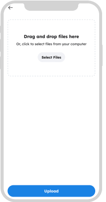
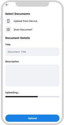
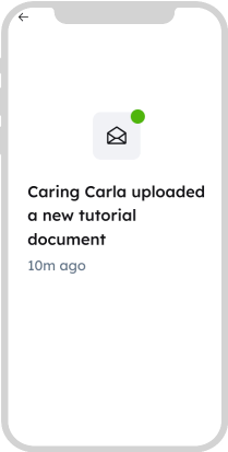
Clara’s at work and can’t make another video. Instead, she takes screenshots of the new UI, creates a simple step-by-step PDF guide, and uploads it via CareConnect. During their call, she lets George know that she’s shared the updated manual.
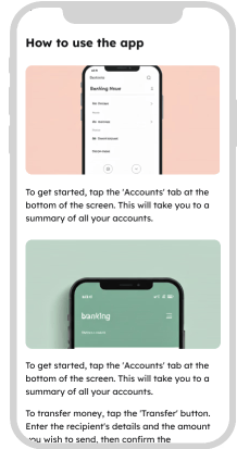
George reopens Tutorials, finds the new PDF, and follows it carefully. Now, he uses the mobile app confidently and independently, thanks to the guide from CareConnect!
What does CareConnect actually do?
For Elders:
One-tap calling to family
Calm interface for viewing tutorials, documents
No logins, no clutter, no confusion
For Children:
Upload guides, tutorials, or appointment documents
Get notified when parents need help
Reduce repeated questions and constant calls
Design for eyes, hands and mind
Since I was designing for elderly users, I had to reconsider everything — fonts, colors, interaction, and layout. I researched accessibility standards, vision limitations, and digital ergonomics. This led to a broader accessibility-first mindset. If a screen feels peaceful to a stressed elder, it will feel good to everyone. So I committed to design focusing on high contrast, legible fonts and clean layouts with minimal decisions.
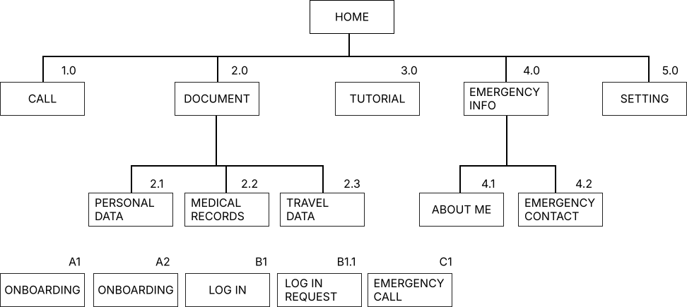
Site map
What I learned
The app, CareConnect, is currently in the UX design stage — built on real stories, thoughtful interviews, and an inclusive design approach centred on those often left behind by technology.Through research, persona development, ecosystem mapping, and mid-fidelity wireframes, I created a foundation for a tool that simplifies digital life for elders and strengthens their connection with children — no matter the distance. While the app hasn't been developed yet, the UX process has given me meaningful insights and a clear direction rooted in real needs — not assumptions.
Next step will include
Running usability tests with elders and their children to validate the core flows, iterating the design based on feedback, especially around accessibility, readability, and simplicity. Collaborating with developers and accessibility consultants to bring the MVP to life. Potentially conducting pilot trials with real families to measure impact.
CareConnect may still be a concept today — but the need is very real. And this case study represents a commitment to designing with care, not complexity.