Branding Case study
Role
Brand Strategist
UI Designer
Researcher
KMD College Rebrand:
A Holistic Transformation
Product
Brand book
Timeline
8 weeks
Tools
Adobe Ilustrator
Adobe Photoshop
Google Slides
Project Overview
This case study details a comprehensive rebranding initiative undertaken for KMD College, a prominent educational institution in Myanmar. The project aimed to revitalize KMD's identity, ensuring it resonated with contemporary educational values, attracted a new generation of students, and solidified its position as an innovative leader in the field. This rebrand sought to visually articulate these aspirations and values, including a creative environment, lifelong learning, empowerment, and inclusivity.
What is KMD ?
Founded in 1986 as KMD Computer Training Centres, KMD College has evolved into a comprehensive institution, pioneering private computer education in Myanmar and partnering with international bodies like LCCI, NCC, and the University of Greenwich since 1992 and 2008 respectively.
An Outdated Identity (Before Rebrand)
Before the rebrand, KMD College faced the common challenge of an identity that no longer fully represented its evolving academic landscape and future aspirations. The existing brand, while familiar, felt dated and lacked the dynamism required to stand out in a competitive educational environment. Its visual elements were inconsistent, failing to convey a cohesive and modern image across various touch points. The previous logos, evolving from 1986 to 2017, showed a need for a unified and contemporary visual system. This disjointed presentation hindered KMD's ability to connect effectively with prospective students, faculty, and partners, making a strategic overhaul imperative.
What shape KMD's rebranding?
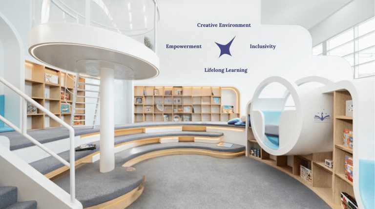
This rebrand was fundamentally shaped by KMD's core values: Creative Environment, Lifelong Learning, Empowerment, and Inclusivity. Every aspect of the new brand identity was meticulously crafted to articulate these principles, ensuring that the college's visual and experiential presence truly reflected its commitment to nurturing curiosity, igniting creativity, and preparing students for the future.
Creative Environment
Lifelong Learning
We cultivate a dynamic atmosphere that inspires innovation and collaboration, offering creative, stress-free spaces where students feel like they're chasing their dreams in an innovative nexus, allowing creativity to flourish and turning ideas into impactful realities.
We foster a culture of curiosity, providing opportunities for continuous growth at all ages.Unlike ordinary schools, we focus on real-world experiences and skills, empowering individuals to upskill and pursue career changes, not just degrees or certificates.
Empowerment
Fostering an environment that values diverse backgrounds and perspectives, we equip individuals with the skills and confidence to thrive personally and professionally.
Committed to valuing and embracing diverse backgrounds, perspectives, and experiences, we create a welcoming environment that enriches the learning experience and ensures that every voice is heard and valued.
Inclusivity
Defining the brand voice
With every element of our brand identity rooted in core values, our tone of voice naturally emerges from them. It is innovative, supportive, inspirational, and warm—reflecting who we are and how we connect with our audience.
Innovative
Supportive
To inspire curiosity and exploration, fostering an environment where new ideas are valued and innovation thrives.
To create a sense of community and belonging, making students feel valued and supported as they pursue their goals.
Inspirational
To ignite passion and ambition, encouraging students to pursue their dreams and embrace lifelong learning.
To build relationships and a welcoming environment, making it easier for students to engage with the community and feel at home.
Warming
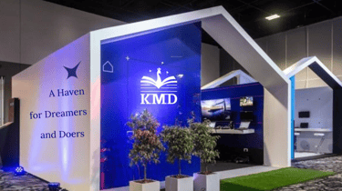
A Unified Brand Experience
The new brand identity for KMD College was meticulously crafted to ensure consistency and impact across every imaginable touchpoint, transforming the institution's presence from fragmented to unified. My rebranding journey began with a deep dive into KMD's core values, its unique position in Myanmar's education sector, and its vision for the future. This foundational research informed the development of a robust creative platform which is ,
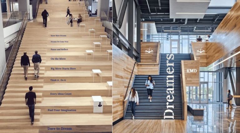
"A Haven for Dreamers and Doers"
This platform emphasized KMD's commitment to nurturing talent, fostering innovation, and creating a vibrant learning community. It served as the conceptual bedrock for a visual language that was both modern and timeless, reflecting academic rigor and youthful energy.
This project was divided into two core parts. The initial phase focused on the comprehensive UX process, encompassing all considerations related to the brand's values, objectives, and new goals, as well as in-depth competitor analysis. This foundational work was completed before any UI considerations began. Please contact me for this UX branding book.
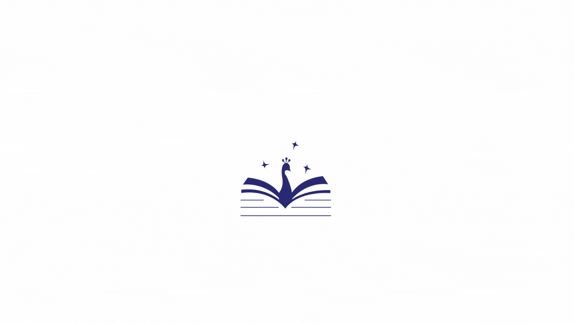
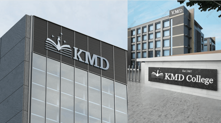
Symbolising Knowledge and Wisdom
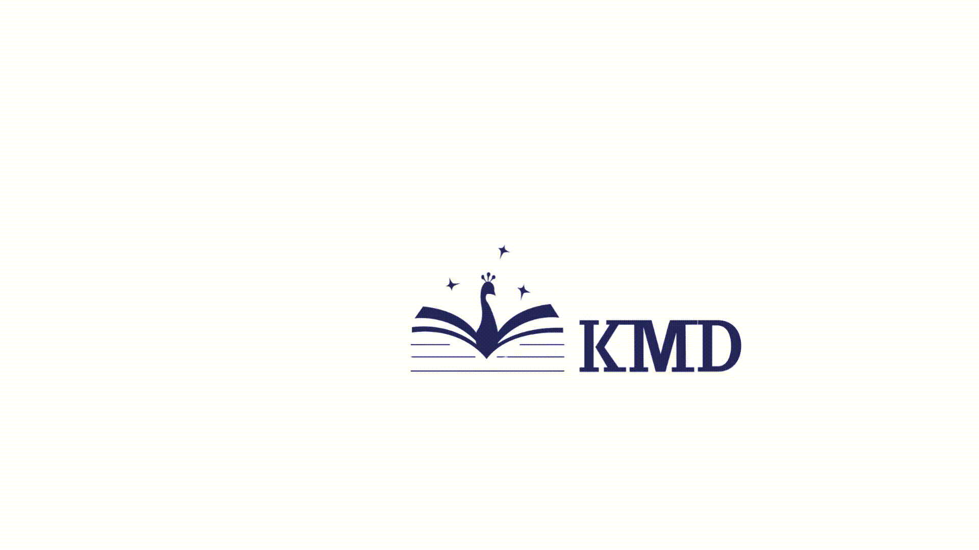
The logo system includes a versatile word mark, logo mark, and various lockups (horizontal and vertical) with defined clear space guidelines to ensure optimal usage across all applications. Strict usage rules were established to maintain brand integrity, prohibiting rotation, use of non-brand colors (other than black and white), and alteration of proportions.
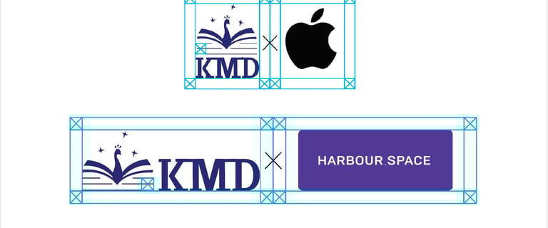
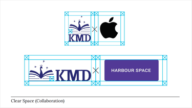
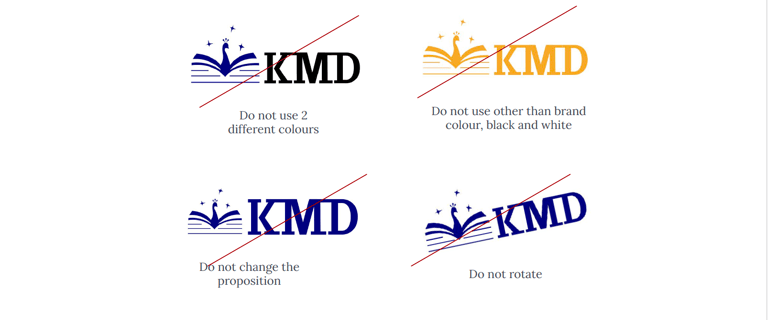
Photo : Clear Space
Photo : LOGO (Don't)
The new KMD logo is a contemporary design that reflects the college's forward momentum and dedication to academic excellence. At its core, the logo combines a “Book of Wisdom”—representing knowledge and learning central to college life—with a peacock, a symbol of wisdom, intelligence, and pride across many cultures in Asia. Also, the three stars represent core student values in Myanmar: စိတ်ဓာတ် (zeit-that) (Attitude), စည်းကမ်း (zii-gan) (Discipline), and ပညာ (panya) (Wisdom/Knowledge). This fusion creates a powerful visual metaphor for education, personal growth, and the future of learning.
A Harmonious Palette
A refreshed colour palette was introduced, carefully selected to evoke professionalism, creativity, and approachability. The palette is divided into:
Brand Colour: The primary blue, signifying trust and stability.
Secondary Colour: Complementary hues that add vibrancy.
Accent Colour: Bright tones for emphasis and visual interest.
Neutral Colour: For balance and readability.
Extensive colour accessibility checks (AA and AAA standards) were performed to ensure maximum readability and inclusivity across all digital and print materials.
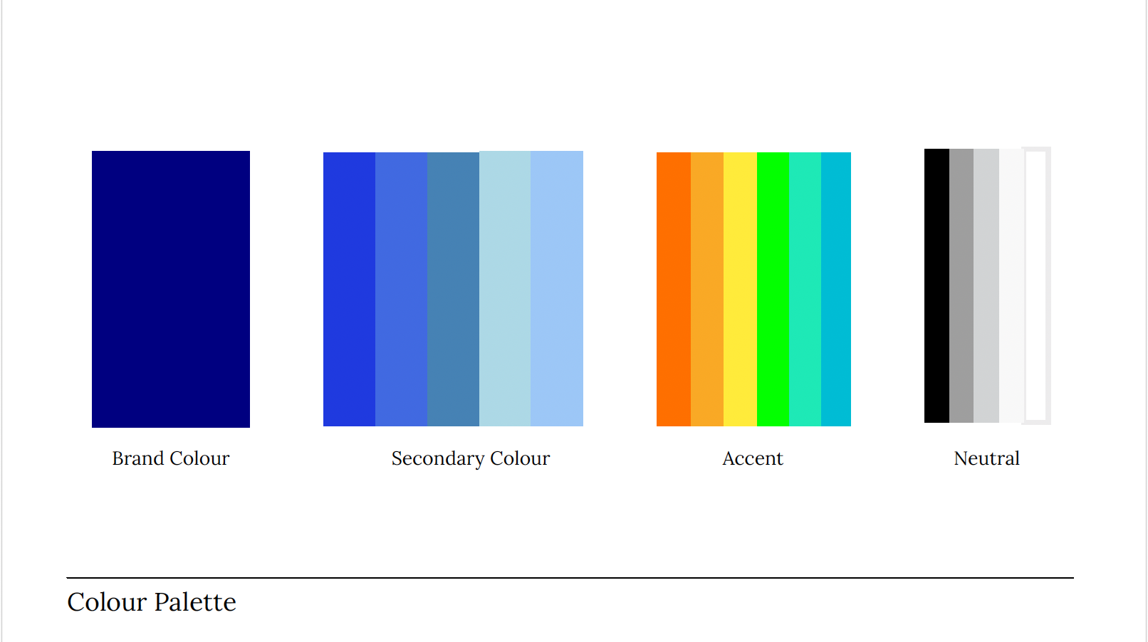


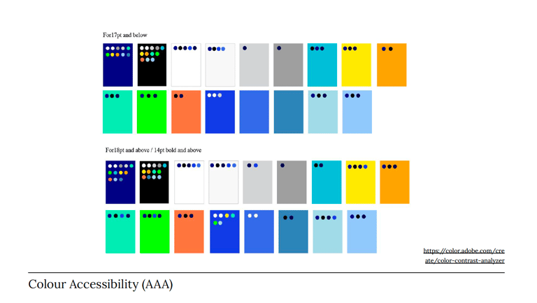

Photo : Colour Palate
Photo : Colour Blindness Test
Photo : Colour Accessibility (AAA)
Typography: Clarity and Consistency
"Lora" was selected as the primary typeface for KMD. As a contemporary serif with moderate contrast, Lora is optimized for screen readability and performs well in print, making it ideal for long-form text and attention-grabbing headlines. A clear typographic hierarchy was established for headlines (H1, H2, H3), body text, italicized emphasis, and Call to Action (CTA) elements, ensuring consistency across all platforms. Times New Roman was designated as the live document font for its similar serif style and readability.
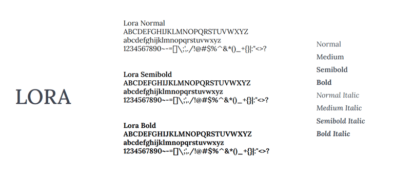

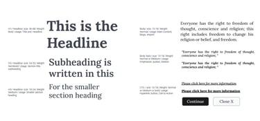
Photo : Typography (Weight)
Photo : Typography (Hierarchy)
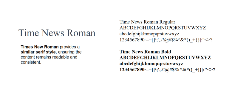
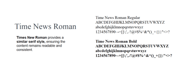
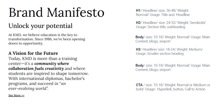
Photo : Typography (Live Document Font)
Photo : Typography (Composition)
Grid & Layout: Structured Visuals
To ensure optimal user experience and visual harmony, a flexible yet structured grid system was developed for various aspect ratios (9:16, 16:9, 3:4, and 1:1). These grids provide a consistent framework for arranging content, images, and interactive elements across all digital and print applications, from social media posts to website pages and presentations.
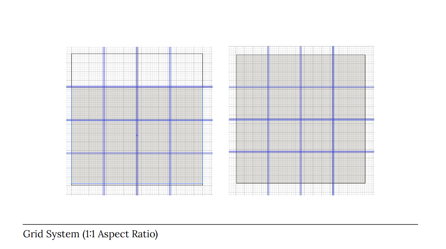
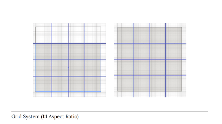
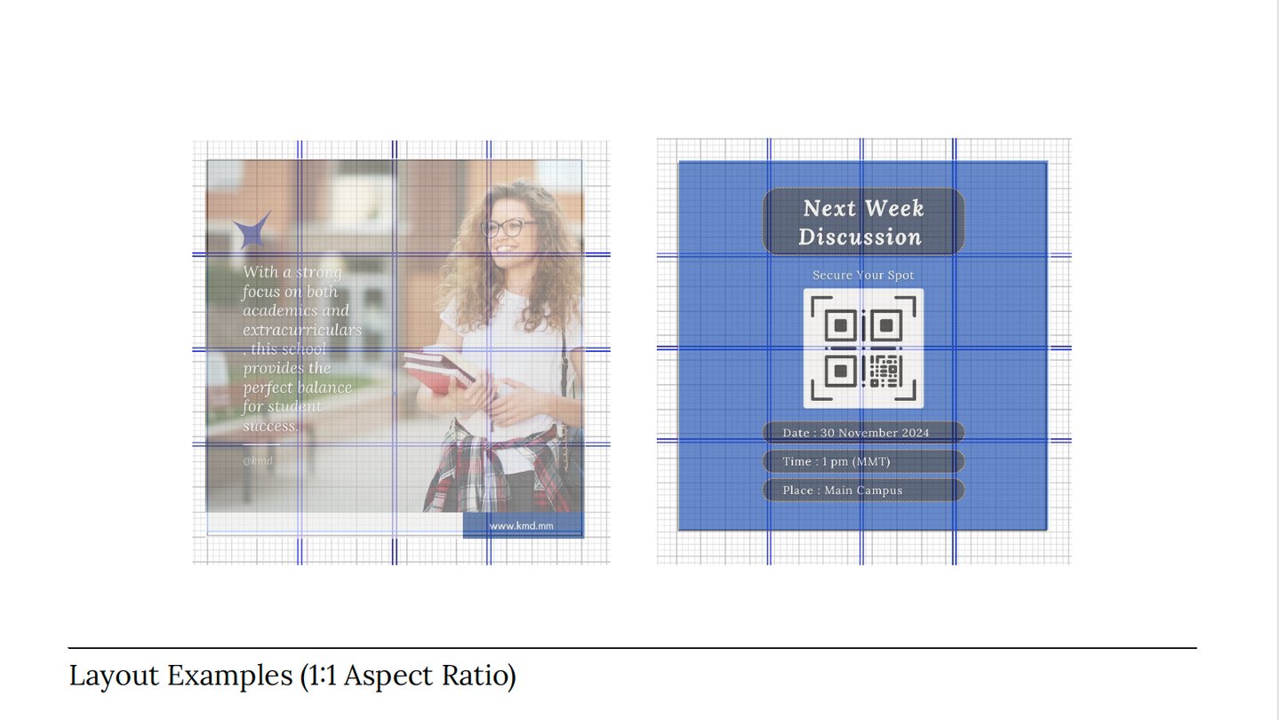

Photo : Grid (1:1 Ratio)
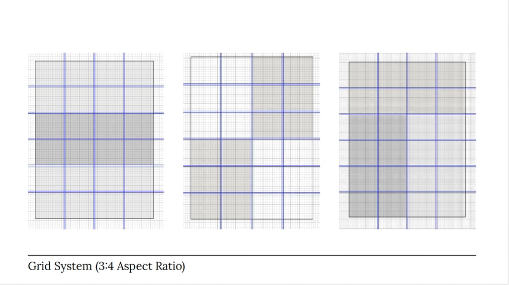
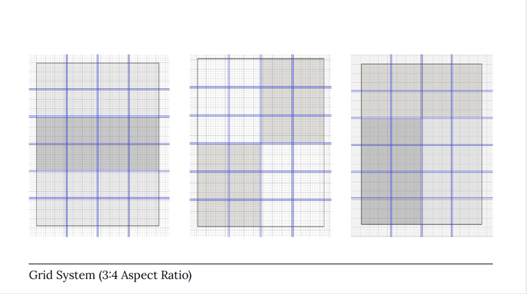
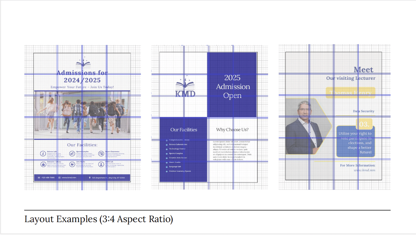

Photo : Grid (9:16 Ratio)
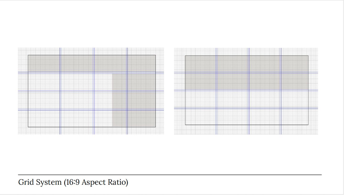
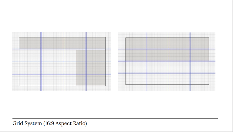
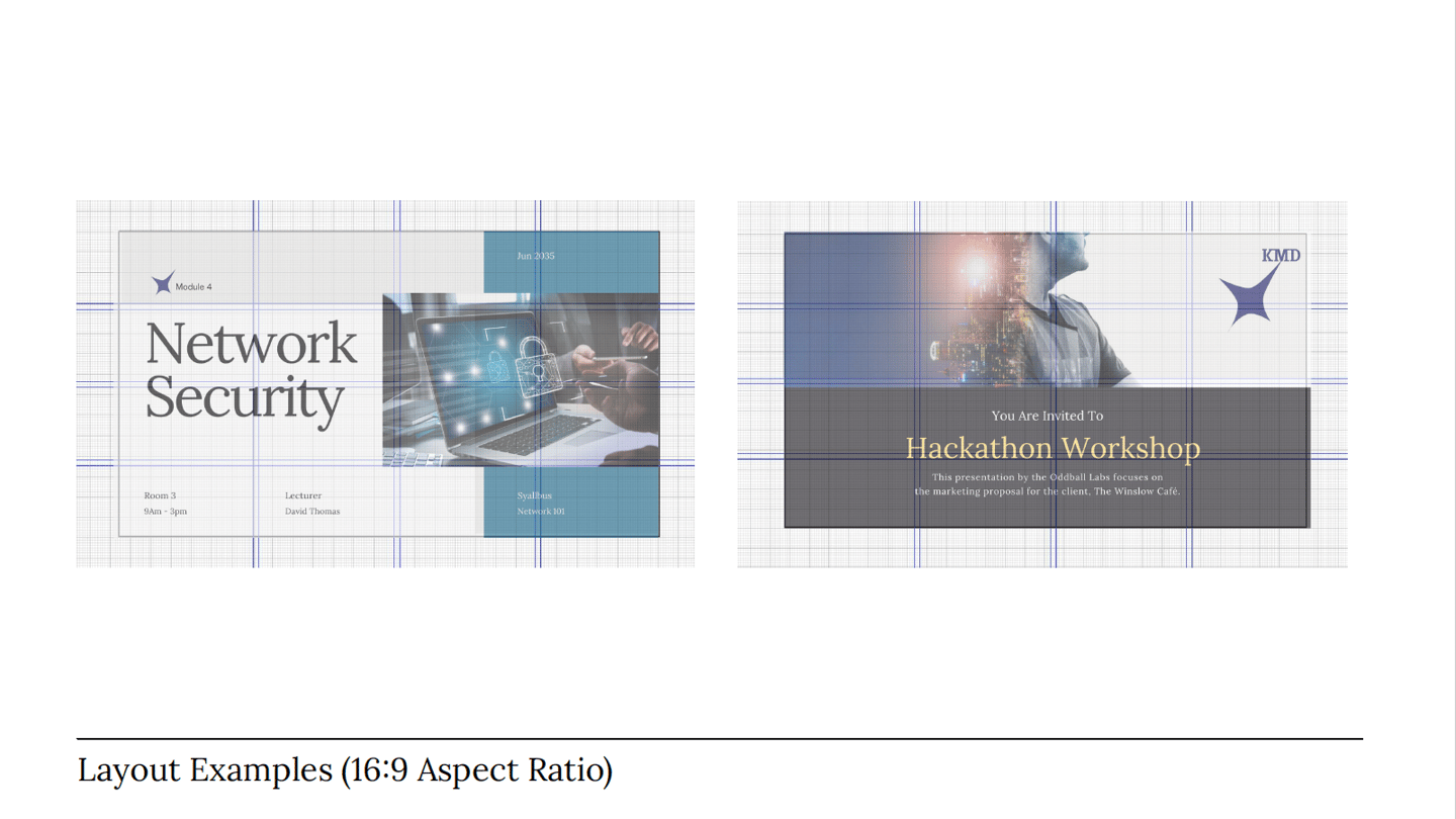

Photo : Grid (9:16 Ratio)
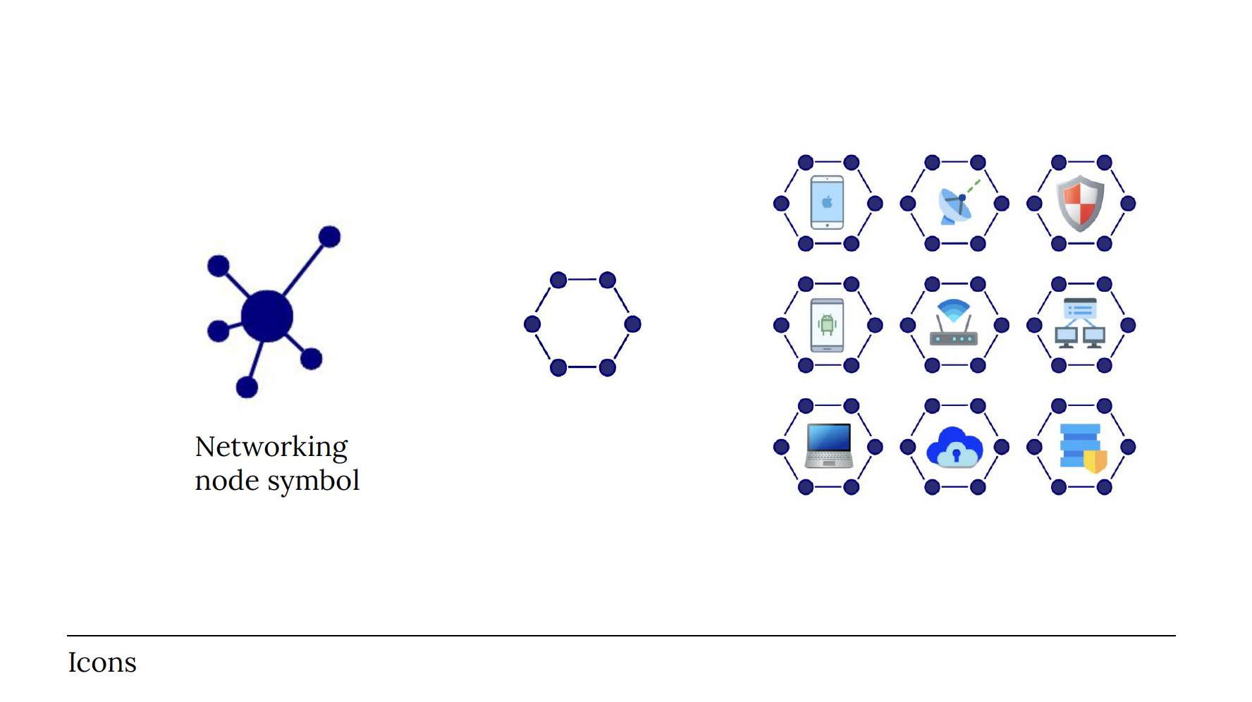
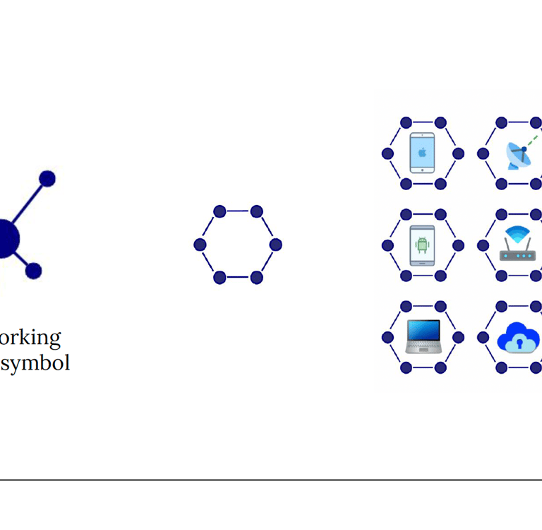
Iconography: A Cohesive Visual Language
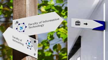
A custom set of icons was created, providing a cohesive visual language for various services and departments. These icons, including a distinctive networking node symbol, enhance navigability and visual appeal, simplifying complex information into easily digestible graphics.

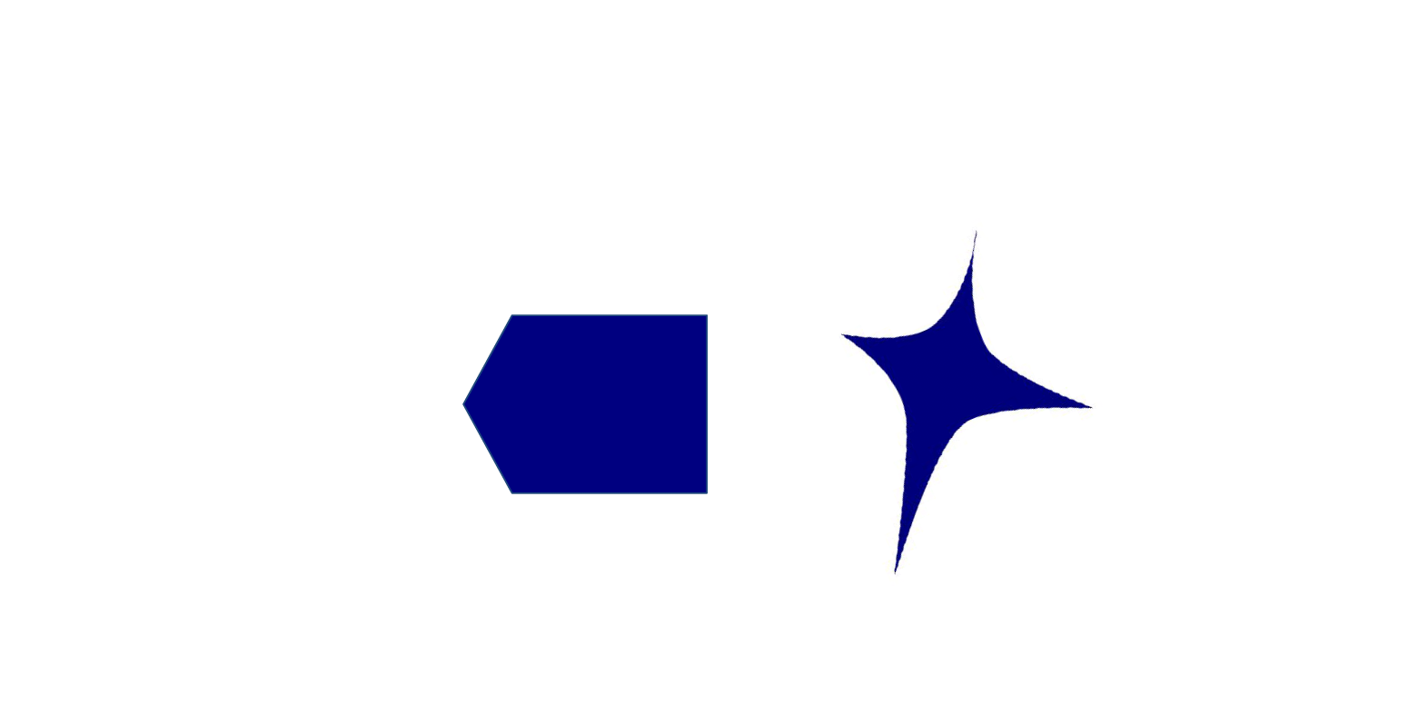
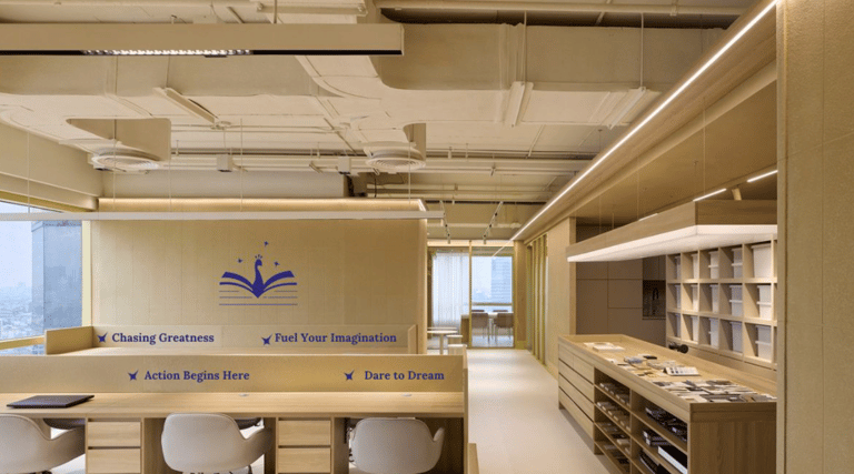
Elements & Illustrations: Adding Depth and Personality
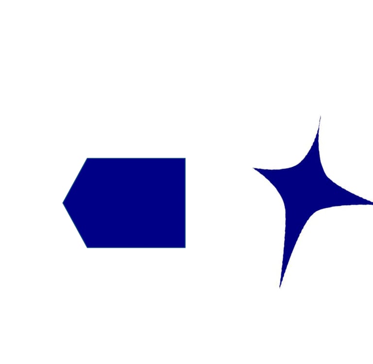
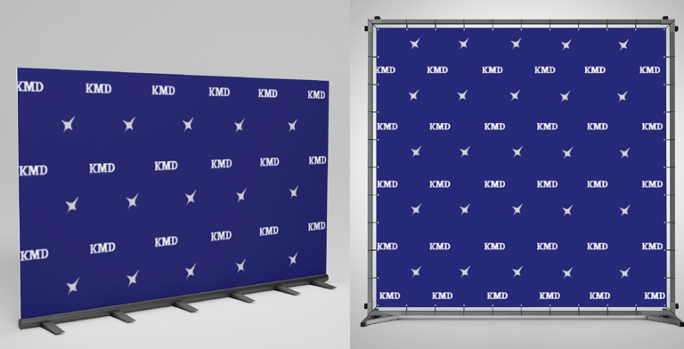
New brand elements and patterns were designed to add visual interest and reinforce the brand's identity. These elements are used creatively across various touchpoints, creating a dynamic and recognizable look. A new illustration style was also developed, featuring engaging and contemporary visuals that resonate with the student demographic and support the brand's narrative.

Brand Alignment Across All Touchpoints
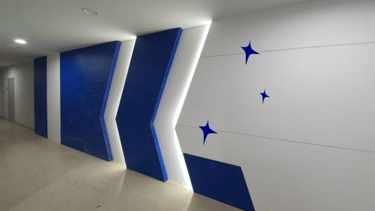
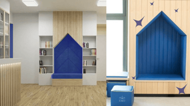
Align every touchpoint with brand elements. Here's how each touchpoint reflects the brand's elements and patterns: all building structures, interior designs, decorations, and directional signs follow the brand’s signature shapes.
A Seamless Online Presence
The new identity was flawlessly integrated across all digital platforms, providing a modern and engaging online experience:
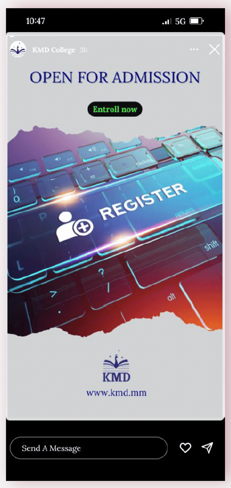
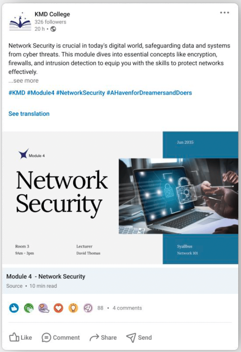
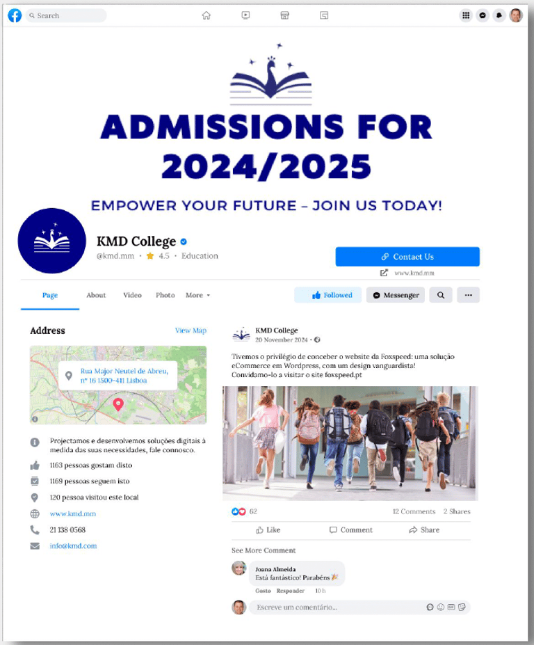
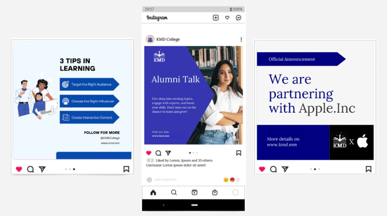
Social Media: Redesigned templates for LinkedIn and Instagram posts, ensuring consistent branding for announcements, alumni talks, and partnership news.
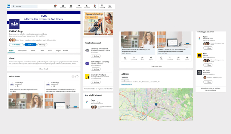
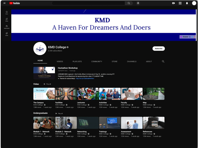
Website: A complete overhaul of the college website, including the Homepage, About Us, Academics, and Student Portal, ensuring a cohesive and user-friendly experience.
Photos : A collection of redesigned social media graphics, showcasing consistent branding across platforms
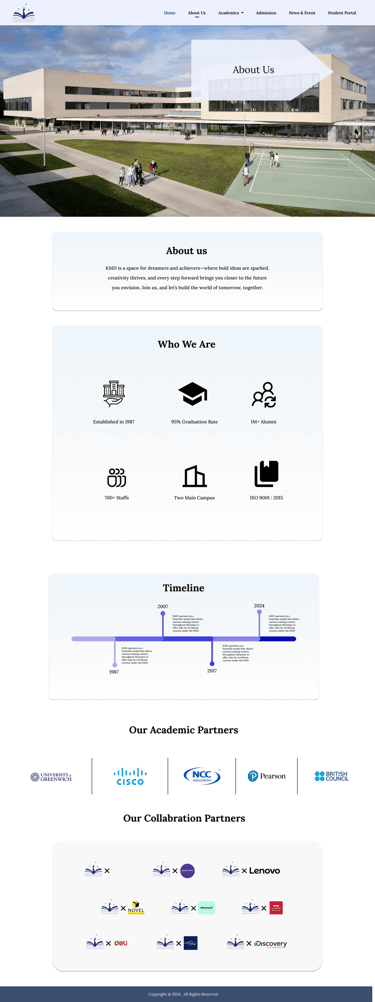
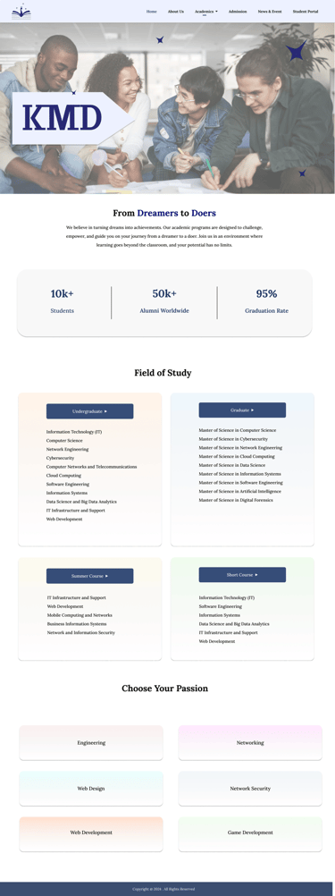
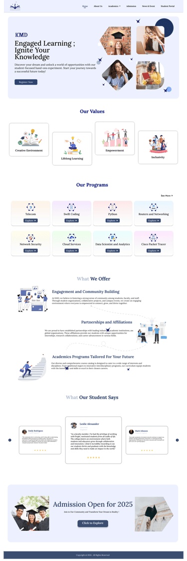
A collection of redesigned website design
Content Calendar: Visual guidelines for content planning to maintain brand consistency.
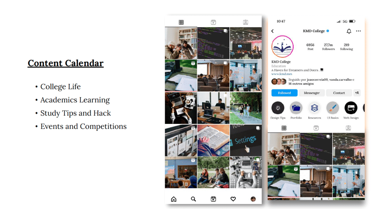


Photo : Content Calendar Planning
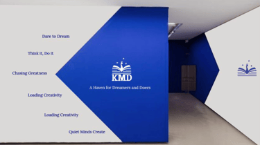
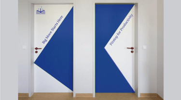
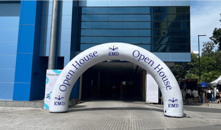
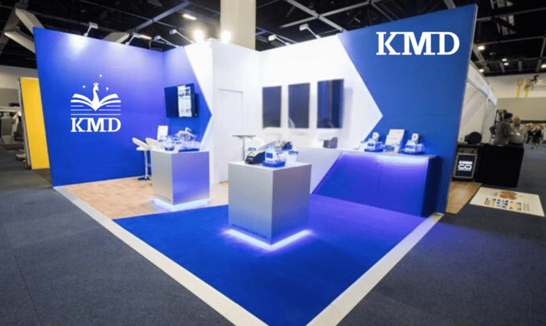
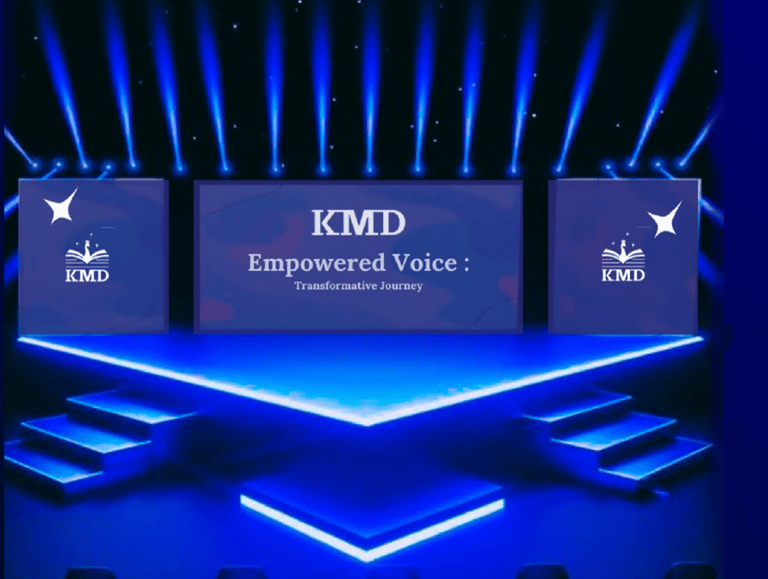
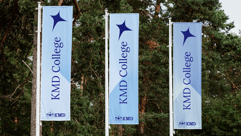
Immersive Campus Experience
The new brand was extended to every tangible touchpoint, creating a truly immersive campus experience:
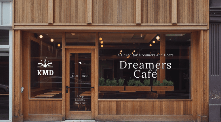
Physical Spaces (Building & Interior Design): The brand's elements and patterns were thoughtfully applied to the college's physical environment, influencing interior design choices, wayfinding signage (including toilet signs), and the aesthetic of common areas like the school cafeteria, private study spaces, and events.
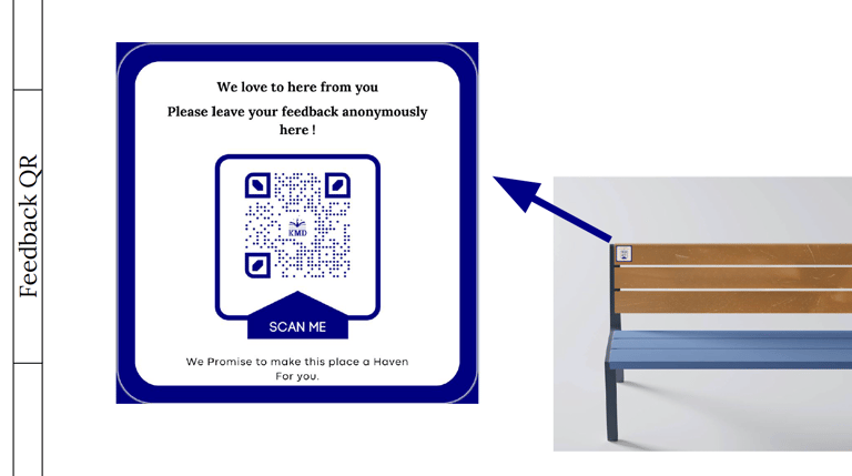
Feedback QR: Integration of branded QR codes for easy student feedback.


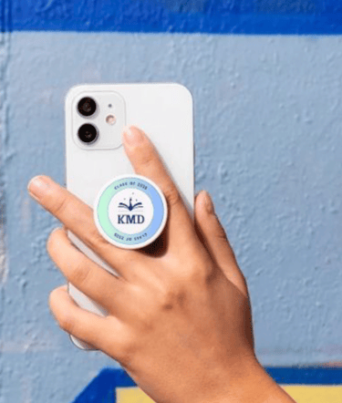
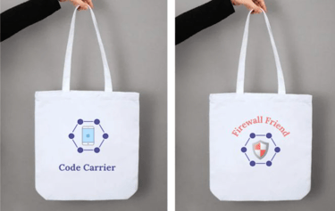
Merchandise: A wide range of branded merchandise, including apparels (e.g., sport team jerseys) and gifts, allowing students and faculty to proudly represent KMD.
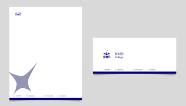
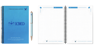
Printing Materials: Consistent design for all printing materials, from brochures to official documents and textbook covers.
Sport Clubs Materials: Branded materials for various sports clubs, fostering a sense of unity and pride.
A collection of the physical environment
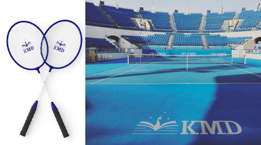
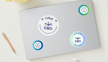
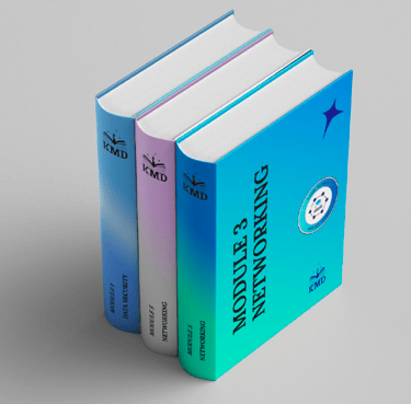
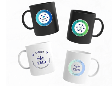


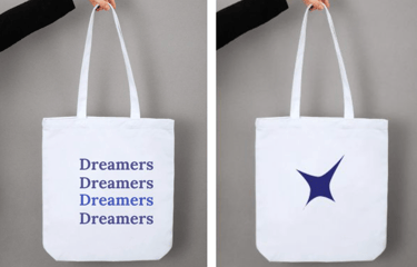

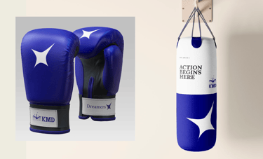
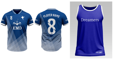
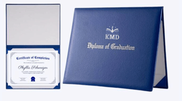
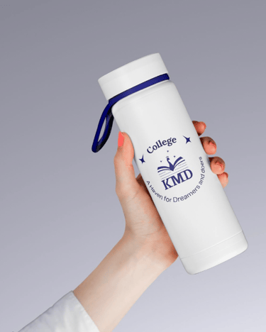
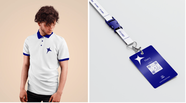

Photos : A collection of Merchandise, Printing Materials, and Sports Club Materials
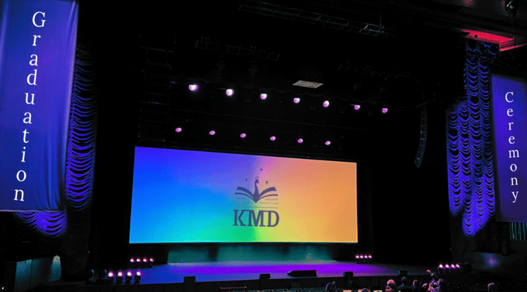
Amplifying the New Identity
The comprehensive rebranding of KMD College culminated in a revitalized and cohesive identity that truly resonated with its target audience. The new visual language and its consistent application across all touchpoints successfully communicated KMD's commitment to modern education and its vibrant community spirit. This strategic rebrand not only enhanced KMD's perception but also positioned it strongly for future growth and engagement within Myanmar's educational landscape. The successful Campaign launch further amplified the new identity, generating positive reception and reinforcing KMD's renewed promise.
Campaign Visuals:
Highlights from the launch campaign, showcasing the new brand in action and its positive reception.
Deliverable Brand Book
If you're interested in exploring the full scope of this project—from early concepts to final execution—you can download the complete presentation here. This rebranding book includes every stage of the process: brand definition, competitor analysis, market positioning, storytelling pillars, brand differentiators, art direction, and more. Want to dive even deeper into the strategy and research behind it all? Feel free to contact me for a detailed walkthrough, insights, or collaboration opportunities.
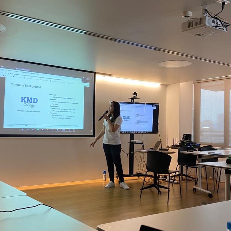
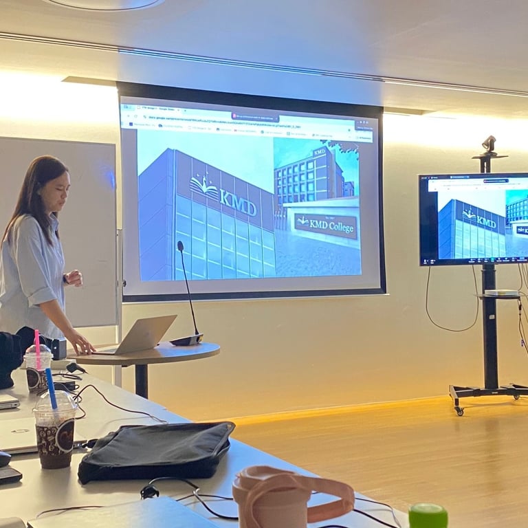
Photo : Research Presentation
Photo : Art Direction Presentation
Conclusion & Learnings
This extensive rebranding project for KMD College was a profound journey in understanding how a cohesive brand identity can transform an institution. A key learning was the critical importance of a thorough UX branding process as the bedrock for all visual design. Without a deep understanding of the brand's history, values, objectives, and competitive landscape, the visual solutions would lack strategic depth and impact.
Another significant takeaway was the power of holistic application. Rebranding is far more than just a new logo; it's about creating a unified experience across every single touchpoint, from the digital screen to the physical environment. Ensuring consistency in color, typography, iconography, and overall aesthetic across digital platforms, interior spaces, merchandise, and even event materials was paramount to building a truly immersive and memorable brand. This project reinforced that every detail contributes to the overall brand narrative and perception. The positive reception to the new identity underscored the value of a well-researched and meticulously executed rebrand in revitalizing an established institution and preparing it for future success.